
(...)-Loading article
The Hero Product Hotspots section in Radian is designed to be used at the top of the page instead of the traditional Slideshow section. Of course, Radian also provides a Slideshow section for you to use
In other words, the Hero Product Hotspots section gives you more customization options to display more introductory content and products than the Slideshow—shoppers can add products to the cart directly without needing to navigate to another page
To set up images for this section, in the Media group, you have the options for Desktop Image and Mobile Image. Radian recommends using the following ratios for Desktop and Mobile:
Of course, that also depends on how you want to present your images
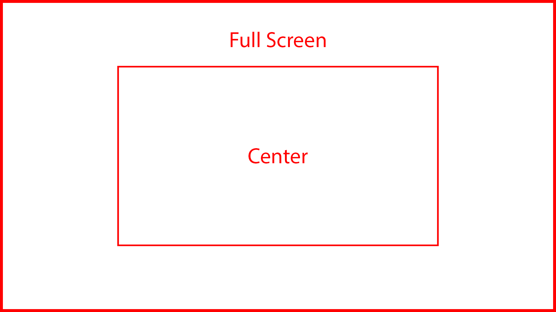
For Desktop image placement options: Center and Full Width, this is an illustration of how it works
To add a hotspot product, click Add Product hotspot -> then in the Product hotspot block -> select the product you want to display
To move the hotspot point to the correct position, use the Horizontal Position and Vertical Position slider to drag them to the position you want. You can also drag and drop the hotspot point directly in the theme editor preview. Once you have placed the hotspot point exactly where you want, look at the bottom-right corner—you’ll see a hint as shown in the image below.

Enter the correct X coordinate into Horizontal Position and Y into Vertical Position
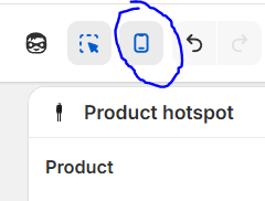
To edit the correct position when displayed on mobile, in the Theme Editor interface, look at the top-right corner. You’ll see a mobile device icon—click it to switch the viewport from desktop to mobile.
Repeat the same movement pattern as above for mobile
To ensure images work correctly on mobile, Radian recommends providing a mobile-specific image version at the Mobile image option