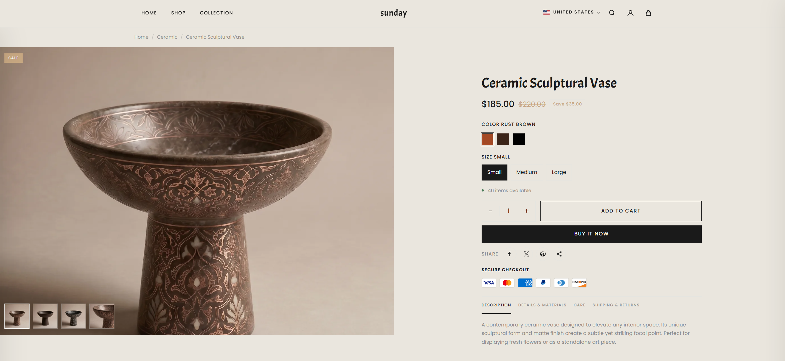
The Product Page showcases detailed product information with a clean, customizable layout. It highlights images, descriptions, pricing, variants, and other key details, providing a seamless shopping experience for customers.
What Makes Renovate Product Page Stand Out?
Flexible Media Layouts: Choose from multiple media layouts like thumbnails on the left, right, or bottom.
Option to use a stacked or slider layout.
Rich Product Media Support: Showcase your items with images, videos, and even 3D models.
Built-In Conversion Boosters:
Sticky Add to Cart bar (optional)
Dynamic Checkout Button (Buy it Now) for faster purchases
Stock Indicators to create urgency
Trust badges and estimated delivery messages for reassurance
Interactive Features: Image lightbox, variant swatches (color, size), and quantity pickers for an intuitive experience.
Pickup Availability: Display pickup options on the product page to inform customers of local availability.
02
Customize Product Page
On the Product Page, you can configure how your product details are displayed, helping customers engage with your items and make purchases easily. Make sure the products are published on your online store before adjusting these settings.
From your Shopify admin, go to Online Store Themes.
Click Customize
In the Theme Editor, use the drop-down page selector and choose Products then Default product.
Adjust media layouts, product details, conversion boosters, badges, pickup options, and interactive features as desired.
Click Save to apply your changes.
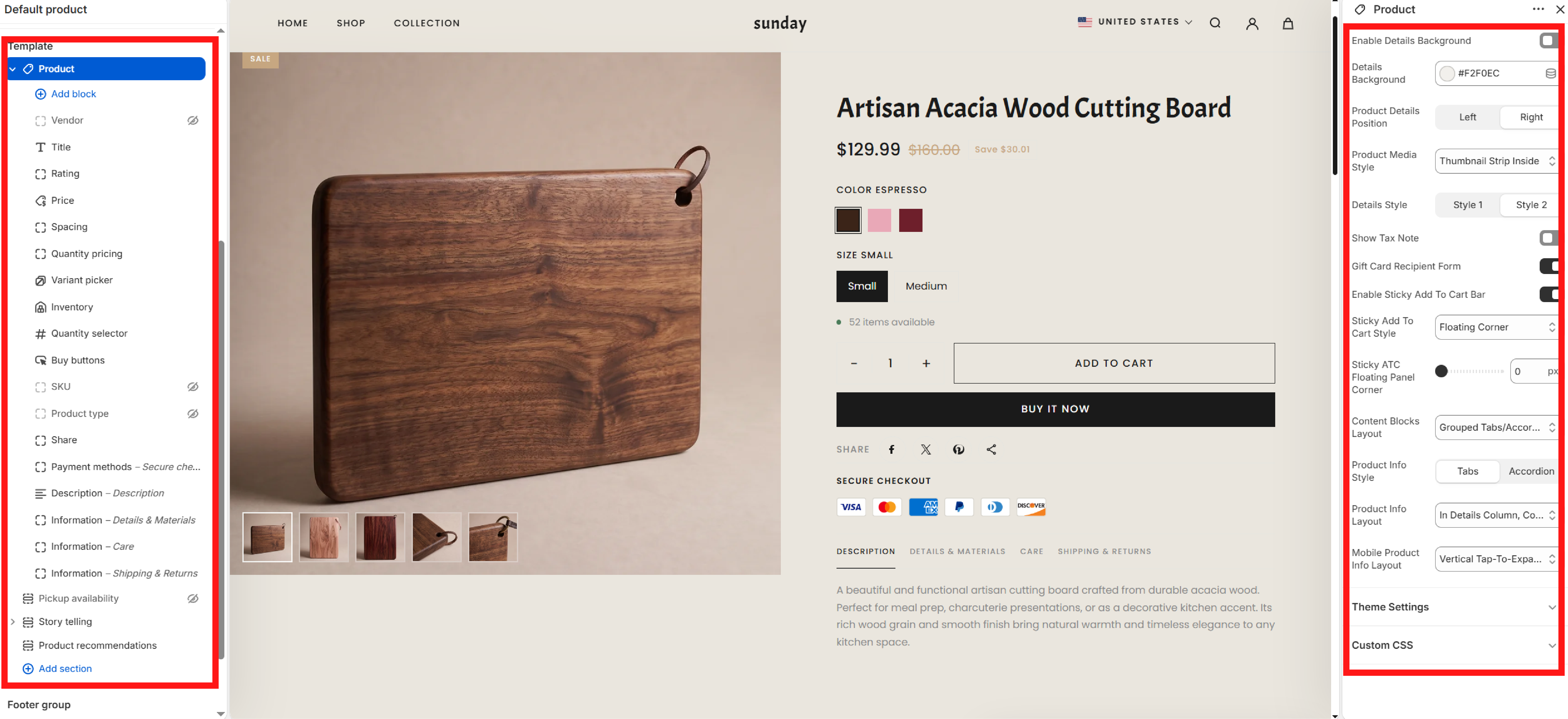
Section Settings
Product section settings are used to edit the overall layout, product media layout, how the sticky ATC button is displayed, and to customize content blocks.
SECTION OPTION
01Enable Details BackgroundEnable background color for product details content block
02Product Details PositionCustomize product details content position
03Product Media StyleVelmora offers 5 different media product display layouts. You can try each layout to see what works best for your store.
04Details StyleStyle 1 displays variant names separately, on the right side. Style 2 displays the variant label and dynamic variant name together as a single block.
05Show Tax NoteDisplaying tax-inclusive or tax-exclusive text
06Enable Sticky Add To Cart BarShow the Add To Cart bar when the user scrolls past the product details section.
03
Adding Story Telling section and connect data
To add the Story Telling section to your PDP (Product Page), follow these steps
You'll see a list of available sections on the left-hand side. Locate the Add section button in Template and click on it.
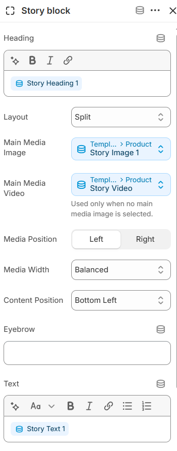
From the list of available sections, find and select Story Telling.
Then click Add Block to add a new Story Block. You can add multiple Story Blocks.
Then, you can click and hold mouse the Story telling section to arrange its position as desired or keep it as default.
07Sticky ATC StyleThe Sticky ATC Bar display style. If you use the Floating Corner style, the bar will appear in a corner on the right side of the screen. This method prevents the bar from stretching too wide on screens with a large horizontal width.
08Content Blocks LayoutThis setting controls how Content Blocks are displayed. If you use Inline Block Order, content blocks will appear in the order they are arranged within the block. If you choose Grouped Tabs, the content blocks will depend on your Product Info Style and Product Info Layout settings.
09Product Info StyleThis feature only works if the content block uses the Grouped Tabs/Accordion Content Blocks Layout. Tabs display content horizontally, while Accordions display content vertically.
10Product Info LayoutCustomize the display position of a Content Block
11Mobile Product Info LayoutCustomize how content blocks appear on mobile
This is a Block Content block
The overall image, on the left is the product information blocks used to display product information, on the right is the section setting customization.
Product Information Blocks
The Product block allows you to add and arrange various content blocks to display detailed information about your items. Each block can be moved and customized to fit your brand's storytelling.
Vendor: Displays the product's vendor or brand name
Title: Display product title
Rating: Display product reviews. You need to use review apps to use the rating feature.
Price: Display product prices, including original price, sale price, and saved price after discount
Spacing: Custom block to increase spacing between blocks
Quantity Pricing: Purchase blocks with minimum quantities and different pricing conditions for B2B customers
Variant Picker: Display product variants
Show Size Guide Button: Display Size Guide button. To set up the Size Chart, refer to the article How to make Size Guide
Inventory: Display available stock
Show Inventory Count: Instead of just showing "in stock", when this option is enabled, it will show the quantity
Pickup availability: Shows real-time information about local store pickup options.
Quantity selector: select the number of items
Buy buttons: display Add To Cart, Buy It Now buttons
Show Buy It Now: Turn on / off Buy It Now button
SKU: Displays the unique Stock Keeping Unit for the selected variant.
Share: Display buttons to share products on social media or copy product links
Payment methods: Display payment methods
To learn how to set up the display of payment method icons, refer to the article Setup Payment Icons
Description: Shows the main product description
Information: Custom content blocks can connect to dynamic data, often used for Details or Shipping & Return
Text
: Description content displayed in the story block
In the demo, we only use this data. If you want to use other data such as Eyebrow, Button URL / Label, you can implement it similarly.
First, go to Shopify Admin -> Settings -> Metafields and metaobjects -> then select Products under Metafield definitions To add a new metafield, select Add definition -> then set up the page as follows:
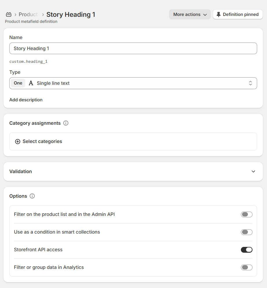
Create metafield for Heading, in the Name field, enter the metafield name; for Type, select Single Line Text
HEADING
01NameStory Heading
02TypeSingle line text
The final setup will look like the image below.
The reason I have a '1' after it is because I have 3 Story Blocks, so I add numbers after them to differentiate.
Similar to Heading, for Text data, do the following: Go back to Products metafields definitions and click Add definition to add a new metafield. For Name, enter Story Text and for Type, select Multi-line text
TEXT
01NameStory Text
02TypeMulti-line Text
Repeat the same for Heading and Text for Image or video but the Type uses a different format.
MEDIA TYPE
01If it's a video, use the Video (File) format.Video (File)
02If it's a image, use the Image (File) format.Image (File)
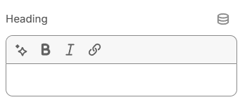
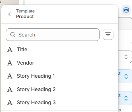
Once you are set up your metafields, return to the Theme Editor. In the Story Block, use the metafield connection icon to connect to the metafield you just created in Shopify Admin.
After clicking the icon, a new dropdown will appear -> select the metafield you created. For example, Story Heading
Repeat the same connection for Main Media and Text
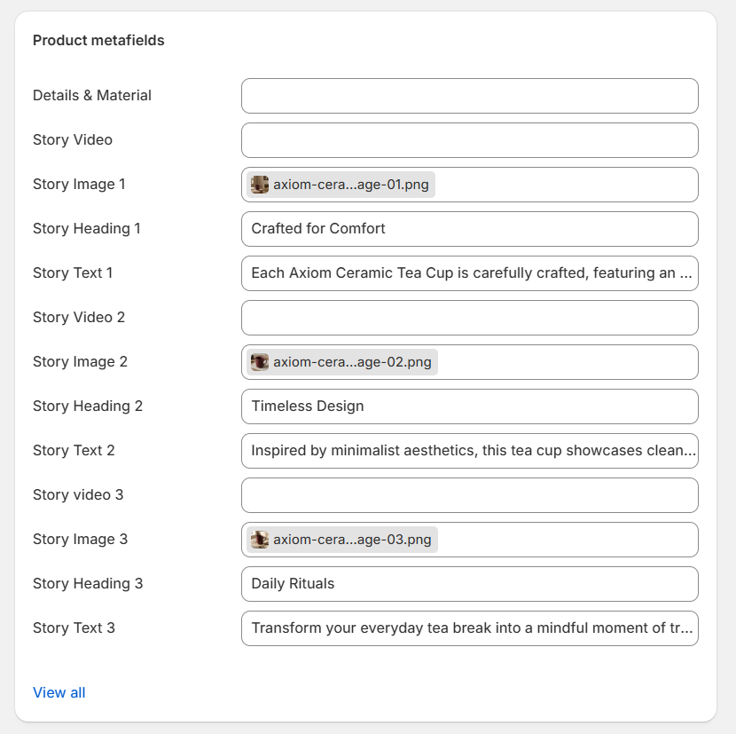
Once all the metafield data is connected, now when creating/editing products, you will see Product metafields at the bottom of the edit page. Add the content you want to display into each metafield. It will look like the image below; I am using 3 Story Blocks.